
Reading a Response-Time Chart: What a Slow Climb Is Telling You
Jul 14, 2026 · 2 min read
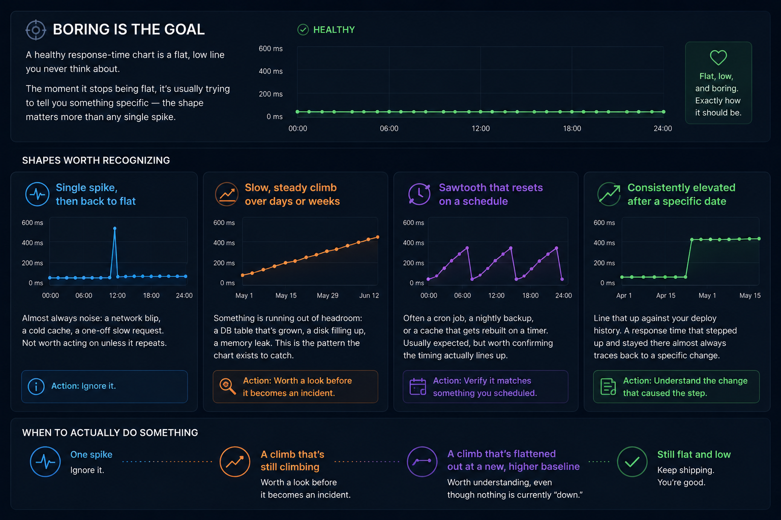
Boring is the goal
A healthy response-time chart is a flat, low line you never think about. The moment it stops being flat, it's usually trying to tell you something specific — the shape matters more than any single spike.
Shapes worth recognizing
A single spike, then back to flat — almost always noise: a network blip, a cold cache, a one-off slow request. Not worth acting on unless it repeats.
A slow, steady climb over days or weeks — the one that matters most. Something is running out of headroom: a database table that's grown past its indexes, a disk filling up, memory that leaks a little more with every deploy. This is the pattern the chart exists to catch, because it's invisible in an uptime percentage until it finally times out.
A sawtooth that resets on a schedule — often a cron job, a nightly backup, or a cache that gets rebuilt on a timer. Usually expected, but worth confirming the timing actually lines up with something you scheduled.
Consistently elevated after a specific date — line that up against your own deploy history. A response time that stepped up and stayed there almost always traces back to a specific change, not a gradual drift.
When to actually do something
One spike: ignore it. A climb that's still climbing: worth a look before it becomes an incident. A climb that's flattened out at a new, higher baseline: worth understanding, even though nothing is currently "down."